The Secret To This Garden Home’s Renovation
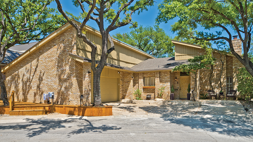
Alvaro Fernandez wanted the garden home at the top of the cul-de-sac as soon as he saw it. As an experienced remodeler and homebuilder, he could tell the house had good bones but needed a lot of updating. He was certain he and his wife, Jennifer, were up to the task, if they could get it at a reasonable price.
The Price Was The Sticking Point.
The original owner was a prominent San Antonio businessman who designed the house for retirement. He and his wife enjoyed a number of happy years there before they died, leaving the home in a trust administered by a local bank. The bank wanted market value for the house—too much in Alvaro’s estimation, because of the updating required. So he waited.
“Months went by, and the house just sat there,” Alvaro says. “There were no buyers. Finally the trustees decided they wanted to sell, and the bank called to ask if I was interested.”
The bank met Alvaro’s price. He and Jennifer became owners of a 1,963-square-foot, two bedroom, two bath home. Built in 1978, it was a custom home with the latest finishes. But 40 years later, the house was a dowager needing major cosmetic surgery.
Alvaro, Jennifer and their sons lived in an apartment while the renovation started.
“This house had a small kitchen that was closed off from the dining room and living room,” Alvaro says. “There was a small opening, almost a pass-through window, in the wall between the rooms. I opened up the kitchen by removing the door and the wall, installing a breakfast bar. I kept the existing wainscoting because it would be too difficult to remove.”
Bar Demolition
He kept the parquet floor in the living and dining room because it was in good shape. But the small bar in the living room had to go. Jennifer and son Alex served as the demolition team.
“The space was a real bar, with a sink, cabinetry, and bar lighting. We tore it all out, to the studs, rewired and installed new Sheetrock. I placed new waist-high wainscoting along the whole living room wall, which now contained an office niche! A new desktop and recessed lighting completed the bar conversion.”
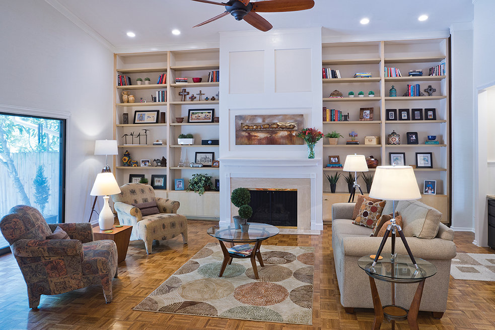
At the end of the living room, the former owner had built extensive floor-to-ceiling bookshelves flanking the fireplace. Because the man was a booklover, he’d installed lots of shelves to house his extensive collection.
“Forty years ago, books on paper were the only medium in existence, so these shelves made sense for the gentleman,” Alvaro says. “But today, everything my family does is digital. Our books are on tablets or laptops. The shelving needed to change.”
He removed the dark shelving and replaced it with lighter wood, spaced at much wider intervals. The shelves now hold art and artifacts collected on trips to Mexico City and other places in the United States.
The gas fireplace was the next project. No mantel existed, and a huge plate glass mirror extended from the ceiling to the top of the fireplace.
“Removing the mirror was a challenge,” Jennifer says. “That’s one of the few things we hired someone else to do. The mirror was heavy, and removal was potentially dangerous.”
With the mirror removed, Alvaro installed multiple electrical outlets, placing them flush with the new mantel’s edge. The outlets are used for Christmas lights and decorations. Marble lights line the firebox and the hearth.
Electrical Wizardry
The ceiling fan was the next project.
“This was a 40 year-old fan,” he says. “This rusted antique weighed a ton. The mechanism was so old that it still had oil in it. I have no idea how they applied oil to the fan because the ceiling is so high and it’s slanted.”
Alvaro removed it piece by piece and installed a much lighter modern fan. “I love technology, especially electrical stuff,” he says. “The ceiling fans in this home are all programmable to respond to room temperature. I set the room temperature and the fan responds accordingly, speeding up or slowing down. It’s very energy-efficient.”
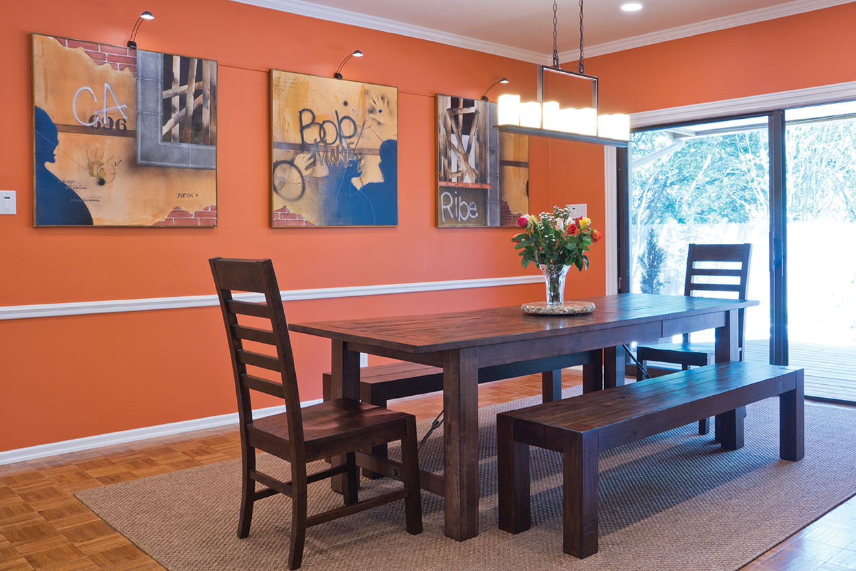
The family painted the home in a neutral cream shade, except for the dining room wall. It is blazing orange.
“We’re not UT Austin fans,” Alvaro chuckles. “That wall is orange to complement the triptych hung there. When I was young, I commissioned those three paintings from a Mexico City artist. The paintings are based on stories of my life I shared with the painter. He interviewed me for hours over dinner one evening. Several months later, I received these and I love them. The colors in the paintings pick up the orange on the wall.”
“Orange was a huge step for us,” says Jennifer, “because we never use vibrant color on our walls. We usually stick to neutrals. “
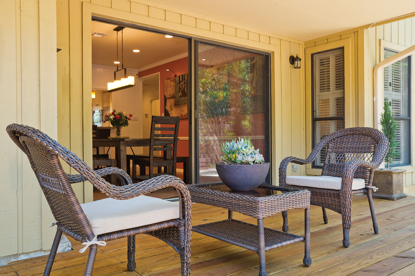
The dining table is a simple design, with bench and chair seating. The chandelier, sourced from Lowe’s, resembles a chrome plank with six alabaster candles. The view from the table through the sliding glass doors is of a verdant backyard.
Custom Kitchen
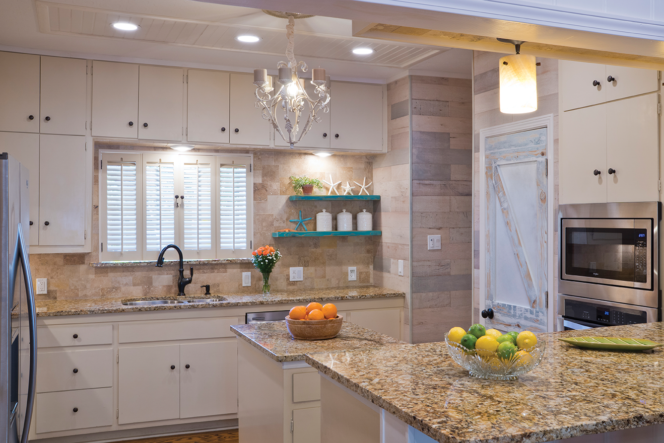
The kitchen was the only room that was mostly gutted. Granite tops were installed on the breakfast bar, island and counters. Alvaro spent several weeks designing a special backsplash pattern for several sizes of travertine squares from Turkey. Appliances are all stainless steel; cabinets are eucalyptus wood. A small chandelier is suspended over the island from a wainscot ceiling. No Sheetrock can be seen in the room.
“Originally, cabinets flanked both sides of the kitchen window, over the sink,” Alvaro says. “But I wanted a coffee bar. So I removed the cabinet on the right hand side and built three shelves that hold our canisters and art. We painted them turquoise to pick up the tint in the barn door.”
The barn door to the pantry is his design. It looks like a traditional Texas barn door. Alvaro applied five colors of paint, sanding and distressing each layer until he achieved the style he sought.
Through a doorway by the pantry is the laundry. It once was a mudroom leading to the garage. Alvaro removed the sink and the stacked washer/ dryer unit. He built platforms for a modern washer and dryer and installed shelving over the washer. All the plumbing and wiring had to be replaced.
“He made a functional space out of an area that was kind of a mess,” Jennifer says. “He even measured the size of the detergent bottles we use to determine the spacing for the shelves!”
Bedrooms and Baths
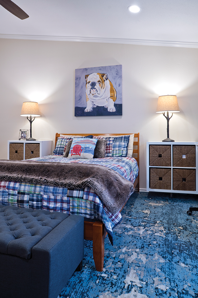
Their sons’ bedroom was originally the homeowners’ craft room. It is a very large room with windows on one wall but only one recessed light. Alvaro added more can lights, spacing them evenly throughout the room. The boys chose furniture from IKEA before the oldest son went off to college. Now the youngest son enjoys solo room possession, watching the big- screen television from a double bed.
“When our oldest son returns from college for visits, he gets to sleep on a floor mattress,” Alvaro says. “The large room easily accommodates it.”
Two large closets with louver doors fill one wall. “We reconfigured the closet interiors because originally there wasn’t any hanging space. With shelves and rods, there’s plenty of room for the boys’ clothes and shoes.”
The guest bath, which the boys share, received a new travertine countertop and under mount sink. Alvaro applied the Turkish travertine on the walls and framed the mirror hanging over the sink. He replaced the shower floor with a pebble surface and installed new bath fixtures.
He also had to install a new wall across from the sink.
“Originally, this was the husband’s bathroom,” Alvaro says. “There was a door that led from the master bedroom into the bath. We replaced the doorway with a wall, giving this room more privacy.”
It also allowed Jennifer and Alvaro to install a Manhattan wall on the other side, in the master bedroom.
“While we installed the new wall, I was able to reconfigure all the electrical outlets and run cable through the wall into the attic. We mounted the big-screen TV over the shelving unit, and you can’t see a wire anywhere. It’s very tidy.”
He replaced the can lights on the far side of the room with pendant lights. “I always thought that pendant lights only belonged in the kitchen, but these provide just the right amount of illumination,” he says.
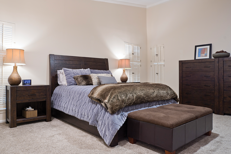
Louvered shutters on the windows flank the queen-size bed. The headboard style matches the dining room table and the dressers. The large furniture perfectly complements the oversized room and soaring ceiling.
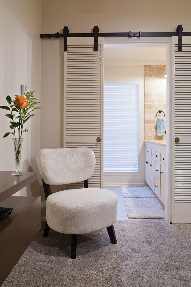
The most interesting feature of the master suite, is the French doors, recycled from louvered doors that originally separated the kitchen from the dining room. Alvaro enlarged the doorway and hung them from a rod, so they slide open, revealing the master bath.
“These look cool, but they have a drawback we never considered when we built them,” he says. “A traditional door blocks noise; these do not.”
In the master bath, the couple removed a ceiling-height cabinet to open up the lavatory space. Alvaro installed a new countertop and placed the travertine stone on the walls. Before he did so, he measured the thickness of the framed mirror they wanted to hang over the sink. Alvaro installed the stone so that the mirror is recessed in it.
His and hers closets in the master suite were combined to make one big closet. “I left the two doors, so it looks like we have two closets,” he says. “But I took out the shared wall. We gained a lot of storage space that way.”
Alvaro installed decking on the front of the house and the back, extending the outdoor living space. New exterior lighting and tile work made the entryway look completely different.
Alvaro and Jennifer are very happy with their updated home.
“You know, we were very lucky with the way things worked out,” Alvaro says. “I still can’t believe how we were able to purchase the house in the first place. It just shows that patience and hard work can bring you home to a great place.”
By Robyn Barnes
Photography by Al Rendon

