 It takes a good eye and abundant patience to see potential in an old ranch-style home. Fortunately Staci Foster possesses both.
“I wanted a ranch-style exterior with an open floor plan,” she says. “This house had good bones, but it needed updating to open up the space. I decided to start from scratch and prepare for a major renovation.”
The home originally had three bedrooms and two-and-one-half small bathrooms, a formal living room, a dining room, kitchen and an area that is now a family room. Fortunately, Staci had previously renovated three houses, so she had the experience and talent to see what needed to be done.
Staci worked with a project manager on the renovation. She replaced all the flooring in the house with beautiful dark bamboo wood and travertine tile in the guest bath and laundry room. She tore out walls and outdated partitions and installed 52 recessed lights throughout the home. Windows along the back of the house were replaced with large sliding glass doors for light and circulation. Every room in the house received some kind of alteration.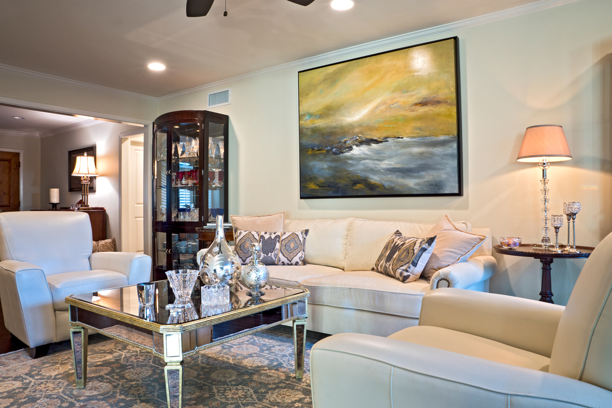
“As most renovations go, this one took longer than the two weeks that were expected,” she explains. Six months after the project’s inception, she was able to move in and move the contractors out.
Now when you cross the threshold, you enter a large living/dining room made for entertaining. The rectangular French oak dining table from Restoration Hardware fits neatly into the sunny alcove, whose windows are accented with plantation shutters. The buffet was an auction find.
“The charcoal drawing of the New Jersey coastline that hangs over the buffet was done by my great-grandfather,” Staci says. “I treasure this piece as it’s all I have that was his.”
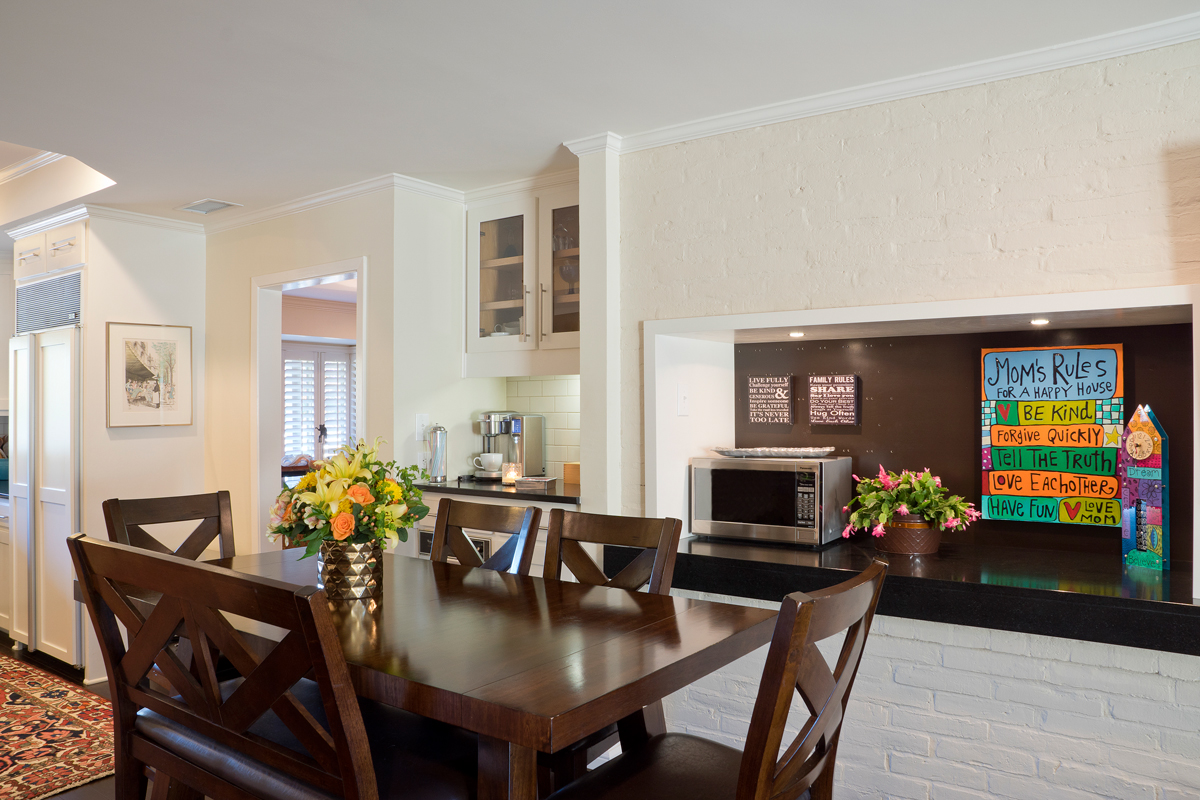
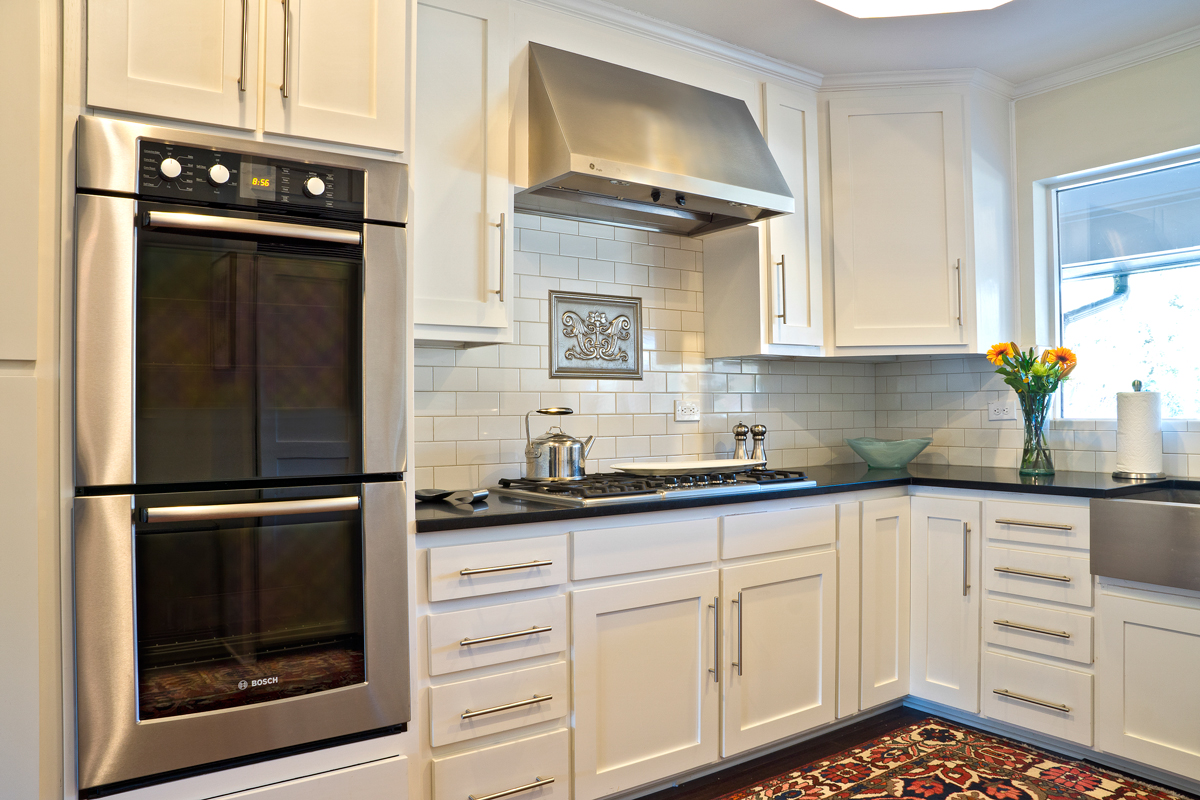 The kitchen is located off the dining room and bears no resemblance to its former self. The door was moved to make better use of the narrow space. All the appliances were replaced, and a new vent hood was installed. Staci chose black honed granite countertops and rebuilt the pantry. All the cabinets were refaced and have slide-out drawers for easy storage.When she bought the house, the kitchen contained a large rotisserie, complete with firebox.
“How many homes do you know can boast of that?” she says. The rotisserie was not up to code, so it was removed and replaced by a recessed counter used for small appliances or serving when entertaining. She was able to gain space for a coffee bar, too.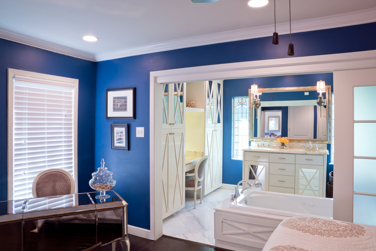
A bar-height table provides eat-in seating and divides the kitchen from the great room. A flat-screen 65-inch television faces a cozy sectional where the cats hang out. Built-in bookshelves behind the sectional store favorite novels and collectibles. Natural light comes from the sliding glass doors, which open onto a view of the pool and backyard.
The master suite is where Staci’s vision for space really shines. “Originally, the bathroom was totally closed off from the bedroom and divided into two small rooms. The layout just wasn’t functional,” she says. “I knocked down the wall between the bedroom and the bathroom and took 18 inches from the bedroom so the bath would have more space. I wanted an en suite feeling, like the grand hotels have, but I wanted the option for privacy, too.”
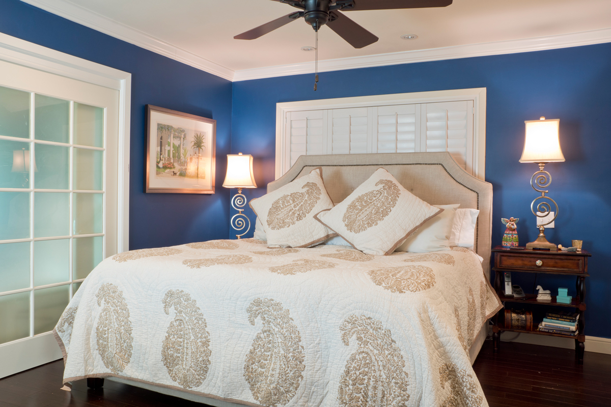 Her solution came in the form of two large doors that divide the bath from the bedroom when she needs privacy.
The large Jacuzzi tub flanks the pocket door-—when the door is open, Staci can recline in the tub and enjoy a good classic movie from the view of the flat-screen television in the bedroom. The glass-walled shower behind her is finished in large 24-inch Calcutta marble tiles and features a rain showerhead.
Stained glass windows flank the vanity. Staci installed large deep built-in drawers and shelves to replace a dresser, which would take up too much space in the master bedroom. All the cabinetry s distinguished by mirrored accents and a lightly stained ivory finish.
Furnishings in the master bedroom are minimal to make best use of available space. A mirrored desk and a king-size bed fill the space surrounded with deep blue walls. The closet is an organized dream. “Can you tell I love the Container Store?” Staci asks.
“This renovation was, in many ways, challenging, but the results were worth it,” Staci states. “The open flow, the way you can move from room to room, the light—I love all of it. It’s a happy place to sit and hang out with my family and friends.”
BY ROBYN BARNES
PHOTOGRAPHY BY AL RENDON

